
Etihad’s “Facets of Abu Dhabi”: Brand Strategy Woven Into Every Touchpoint
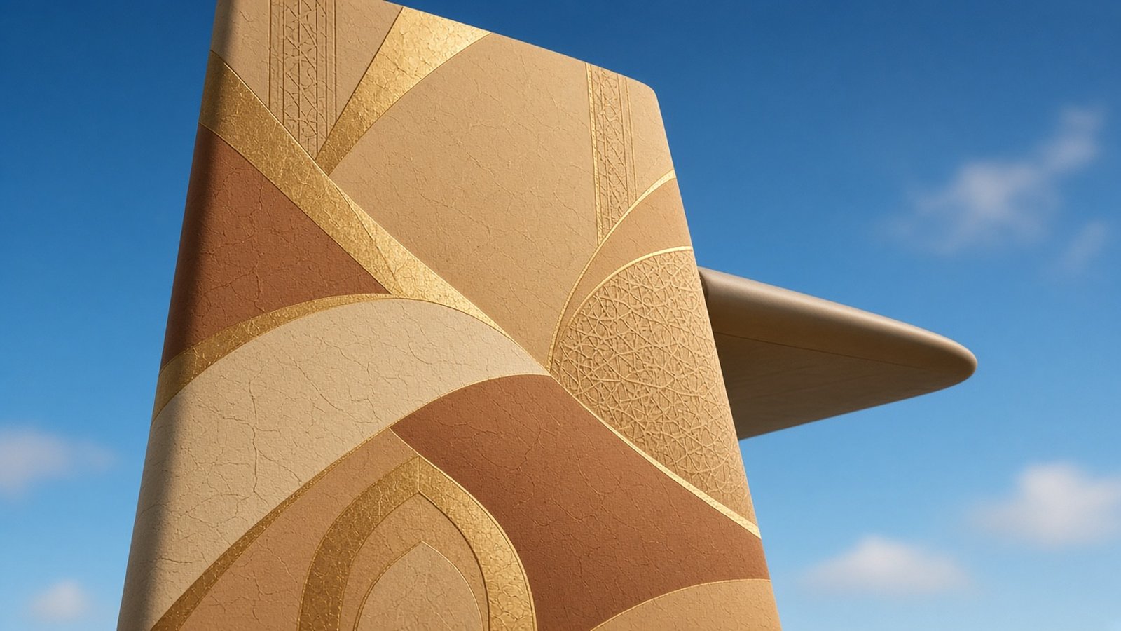
Walk through any airport and you will see dozens of aircraft tails. Most carry a logo and a colour, and most are forgotten as soon as you look away. A few carry something richer: a visual language that tells you where the airline comes from and what it stands for before you read a single word.
Etihad Airways set out to create exactly that with its “Facets of Abu Dhabi” identity, developed with Landor. The project is a compact but powerful example of brand strategy implementation, because it shows how a single, well-researched visual asset can be carried from the fuselage to the brochure to the lounge seat. For businesses in the UAE that want to signal where they come from without falling into cliché, it is a case worth studying closely.
Etihad appears here strictly as a public case study; Areesto has no relationship with the airline. If you want the framework behind the example, start with our guide to brand strategy in Dubai.
The Strategy: A Progressive Hub Rooted in Heritage
Etihad’s strategic aim, as described in the source we reviewed, was to position the airline as the carrier of a progressive cultural hub that is rooted in Emirati heritage. That sentence contains a tension that many UAE brands share: how do you look modern and international while staying authentic to local culture?
Lean too far towards heritage and the brand can feel like a souvenir. Lean too far towards global modernism and it becomes another anonymous premium brand. The answer Etihad chose was to find a visual idea that holds both at once.
Step One: Draw From Place, Not From Clichés
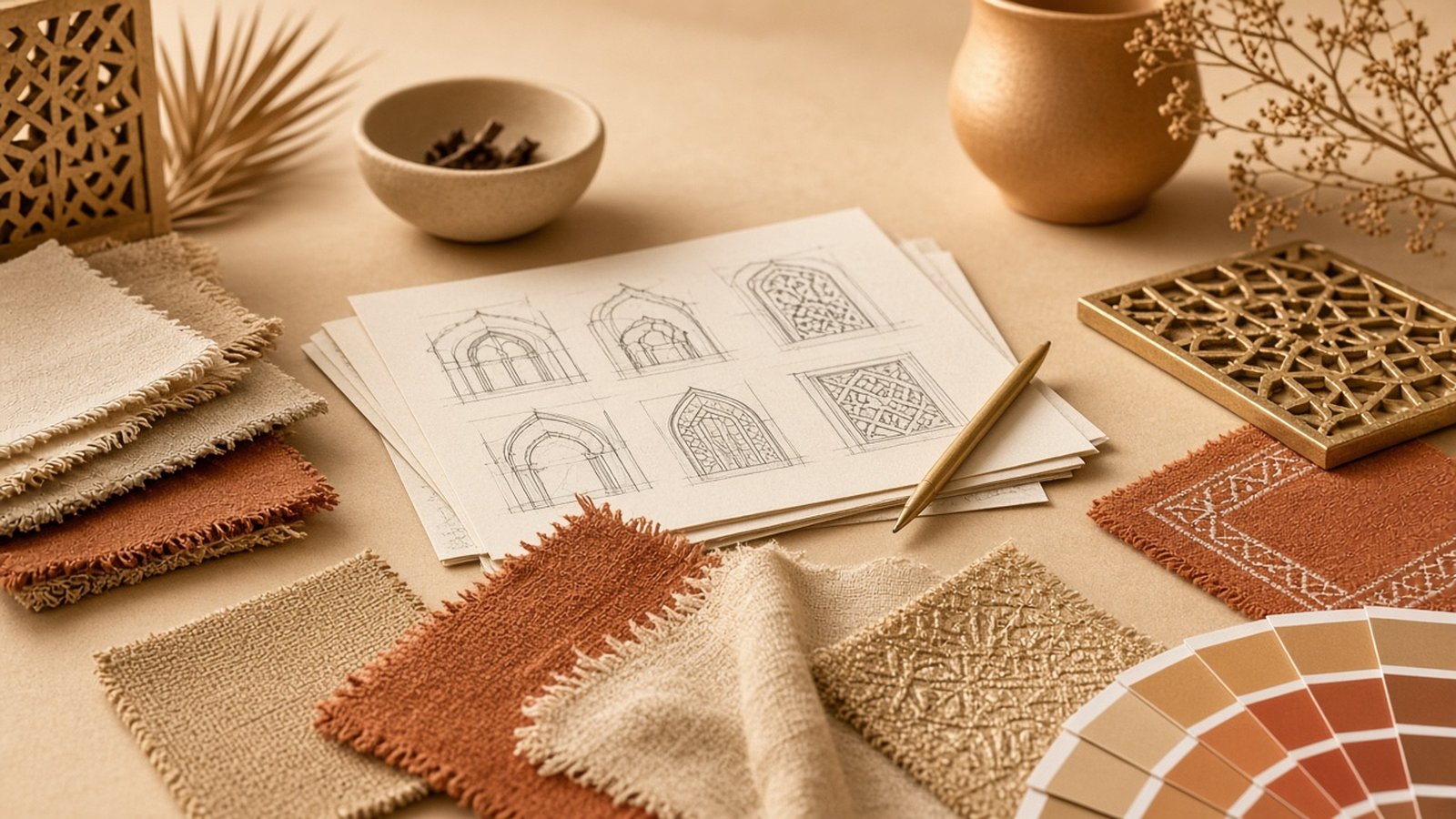
Landor based the new pattern on three sources: Emirati design, desert landscapes and Abu Dhabi architecture. These are specific, observable references rather than generic “Arabian” decoration. The result is a pattern of facets, a geometric language that can feel contemporary while carrying the memory of the land and the city.
This is a craft lesson worth underlining. Place-based branding works when it comes from careful observation of a real place. It fails when it borrows the most obvious symbols that every other local brand is already using. If your brand’s heritage story could be told with the same three icons as everyone else’s, you have not found it yet.
Step Two: Research the Options With Real People
Before choosing a final direction, Etihad researched livery options with two groups: Emiratis and international travellers. That dual audience matters. An airline from Abu Dhabi has to feel authentic to the people of the country and also appealing and understandable to passengers from around the world.
Testing with both groups protects against two different failures. Local audiences can tell you whether the reference feels genuine or superficial. International audiences can tell you whether the design reads as premium and welcoming, or as confusing and foreign. A brand serving the UAE’s mix of residents and visitors faces the same double test.
Step Three: Apply One Asset to Every Touchpoint
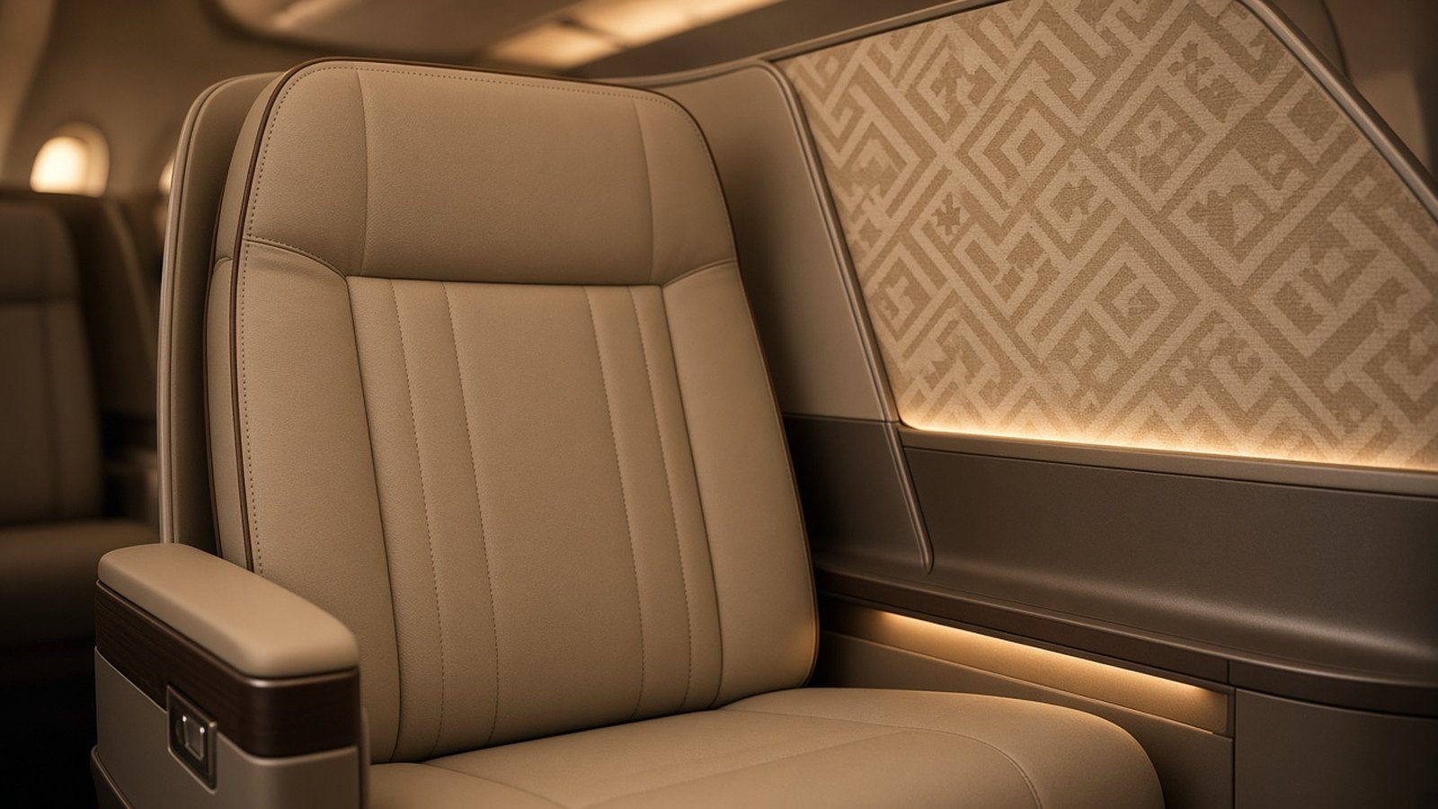
The heart of the implementation is consistency. The same pattern was not limited to the aircraft livery. According to the source, it was applied to:
- Cabin interiors.
- Advertising.
- Brochures.
- Lounges.
- The aircraft themselves.
This is what turns a design into a brand. A passenger might first notice the pattern on a tail at the gate, then see it again in a lounge, on a seat, in a printed brochure and in an advert months later. Each encounter reinforces the last. The asset becomes a signature, recognisable even without the name.
Most brands do the opposite. They spend their energy on the logo and let everything else drift. The livery is new but the lounge is old, the brochure uses a different style, and the advertising agency invents its own look each season. The customer never sees a single, coherent brand.
Step Four: Plan the Rollout Realistically
Some touchpoints are fast to change and some are slow. A brochure can be reprinted in weeks. An aircraft has to be taken out of service to be repainted. Etihad planned to repaint its whole fleet of more than 100 aircraft over three years, starting in 2014.
That timeline is a useful reminder that implementation is operational, not just creative. A realistic rollout plan sequences the quick wins and the slow changes so the brand moves forward steadily without disrupting the business. For a smaller company, the equivalent might be updating digital channels immediately, then uniforms, then vehicle wraps and finally permanent signage as leases and budgets allow.
What About Results?
The source we reviewed does not state any results or performance figures for the identity, so we will not suggest any. What it documents is the process: a clear strategic aim, a pattern drawn from real local references, research with two audiences, application across the full experience and a phased rollout plan.
How Dubai Businesses Can Apply the Etihad Approach
You do not need a fleet to learn from this. A restaurant, a hotel, a real estate developer or a beauty brand can use a single place-rooted visual asset in the same way:
- Define the tension in your positioning, such as modern yet rooted, or premium yet welcoming.
- Study real local references: architecture, landscape, craft, materials, light.
- Turn them into one distinctive asset, such as a pattern, texture or graphic device, rather than a pile of symbols.
- Test it with both local and international customers.
- Apply it everywhere customers spend time: interiors, packaging, print, digital, uniforms.
- Plan the rollout in phases, from quick digital wins to slower physical changes.
Hospitality and property brands benefit especially. See our thinking on positioning hotels in Dubai and real estate projects in Dubai.
When you are ready to build an identity system that works across every touchpoint, our branding services in Dubai cover research, identity design and rollout guidelines, and our brand positioning approach helps you define the strategic tension first. For another nation-rooted example, read about the UAE Nation Brand and its “7 Lines”, or see the full brand strategy implementation framework.
Frequently Asked Questions
What is “Facets of Abu Dhabi”?
It is the visual identity Landor developed for Etihad Airways, based on a pattern drawn from Emirati design, desert landscapes and Abu Dhabi architecture.
What was Etihad’s strategic aim?
To position Etihad as the airline of a progressive cultural hub that is rooted in Emirati heritage.
Where was the pattern used?
On the aircraft livery and also in cabin interiors, advertising, brochures and lounges.
How long did the rollout take?
Etihad planned to repaint its whole fleet of more than 100 aircraft over three years from 2014.
What is the lesson for a Dubai SME?
Use one distinctive visual asset rooted in place, and apply it to every touchpoint, not only the logo.
Give Your Brand a Signature Customers Remember
A logo is only the beginning. If you want a visual signature that works from your website to your shop floor, email us at office@areesto.com. We will help you find the asset that is truly yours and plan how to roll it out across every touchpoint.