
Car Rental Website Design Inspiration
This page is a gallery of layout patterns for car rental websites: how the home page starts, how fleet cards are built, how booking works on a phone, how an Arabic RTL screen should mirror the English one, and how deposits and trust are shown. These are Areesto concept designs, clearly labelled, not screenshots of client work — unless a real project is shown with permission. “Auto rent website design” is the same topic under an older name.
If you need this built for a Dubai or UAE fleet, see car rental website design and development in Dubai.
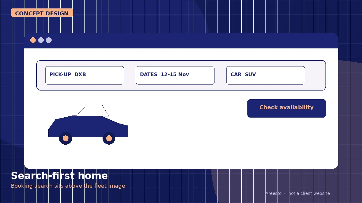
Search-first home
The first screen is the booking search: pickup, dates and car class, not a full-width slider that hides the form. Use this when most visits come from people who already intend to rent. Do not use it as a substitute for brand or fleet photography on a luxury site — the search can sit on top of a still, not a carousel of six hero images.
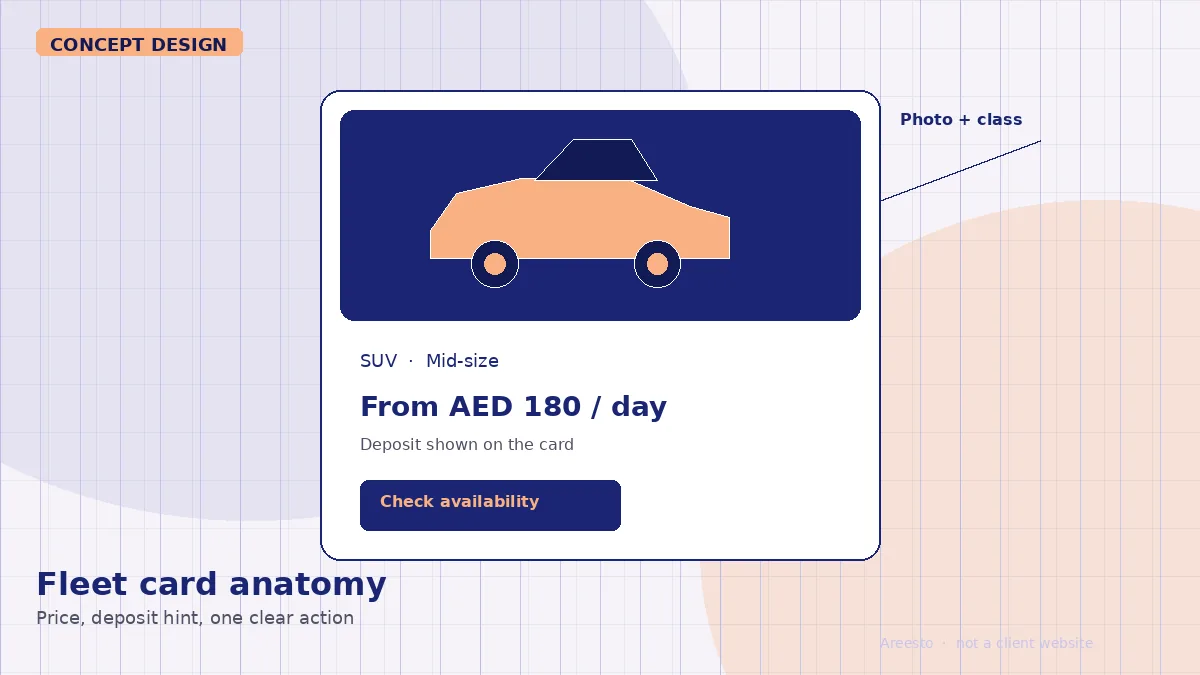
Fleet card anatomy
Each card should show the car, the class, a daily or monthly price, a deposit hint, and a single clear action (check availability or book). Use this on category and search-result pages. Do not hide the deposit until the last checkout step, and do not use a card so dense that it cannot be scanned on a phone.
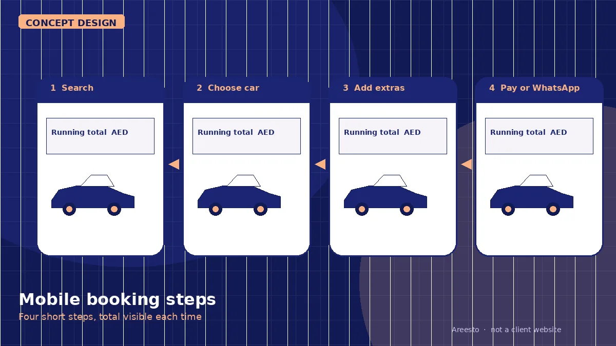
Mobile booking steps
A practical mobile path is four steps: search, choose a car, add extras (insurance, Salik, child seat, delivery), then pay or confirm on WhatsApp. Show the running total after every step. Use this when the majority of bookings start on a phone. Do not add account creation before the renter has seen a total.
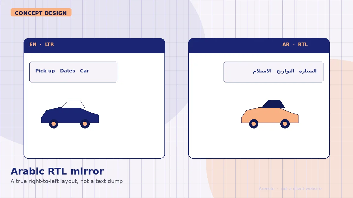
Arabic and English RTL mirror
The Arabic site is a true right-to-left layout, not a translated text block inside an English template. Navigation, the booking form and prices flip direction. Use this whenever you serve Arabic-speaking renters in the UAE. Do not ship a machine-translated copy with left-aligned forms and broken numerals.
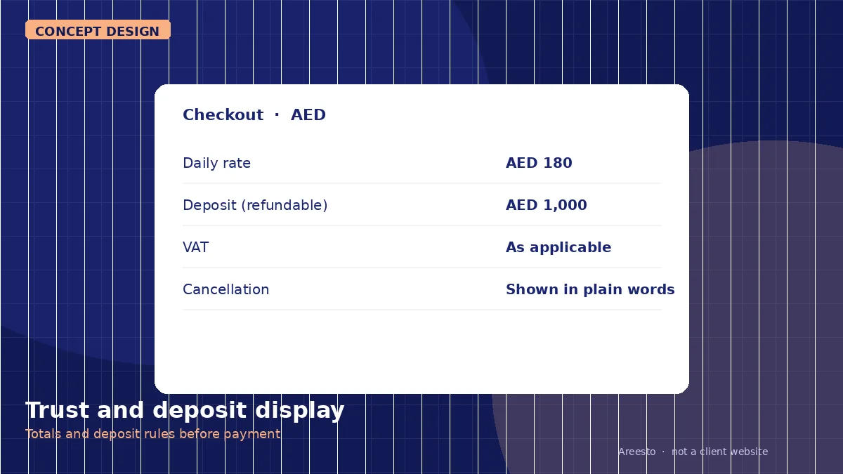
Trust and deposit display
Deposits, excess, VAT and cancellation rules should be visible before payment, in plain words, next to the total. Use this on every checkout and car page. Do not bury the deposit in a terms PDF. Renters in Dubai expect to see the figure before they pay; hiding it is how bookings stall.
When to use these patterns
A daily and airport fleet usually needs the search-first home and a short mobile checkout. A luxury fleet can keep a stronger visual first impression, but the search, the deposit and the Arabic layout still have to be there. If you are comparing layouts for a new site, start with the pattern that matches how your customers actually book, then talk to us about building it.
Car rental website design and development in Dubai is the service page for a live build. Related: automotive marketing and car rental SEO in Dubai.